Future euro banknotes
Published:

The European Central Bank announced the ten shortlisted designs from the design contest for the future euro banknotes. My favourite is design I, closely followed by design J.
After 20 years, it’s time to review the look of our banknotes to make them more relatable to Europeans of all ages and backgrounds.
Given today's political climate I am unsure if Mrs Lagarde and I have the same people in mind when we say "Europeans of all ages and backgrounds", but I will assume she did mean Europeans here. Under this assumption the goal is a worthy one. I see nothing wrong about having the design of the common currency's banknotes be relatable to people living as far apart from each other as eg, the Latvians and the Portugese.
The reason
To quote ECB's own website, "Redesigning banknotes ensures they remain secure and respond to evolving needs and expectations." There are four reasons given for the redesign.
- Better reflect Europe's identity and values
- Stay ahead of counterfeiting techniques
- Improve inclusion and accessibility
- Enhance environmental sustainability
Again, in today's climate the claim that the banknotes need to reflect "Europe's identity and values" can be interpreted in wildly different ways by different people. Just ask, for example, someone who votes for Jean-Luc Mélenchon in France and someone who votes for the FPÖ in Austria, what do they think Europe's identity is, and who "Europeans of all backgrounds" are.
The themes
There were two themes given to the designers who participated in the contest:
Europe’s rich cultural heritage and its dynamic cultural and creative sectors strengthen our shared European identity, forging a shared sense of belonging. Culture promotes common values, inclusion and dialogue in Europe and beyond. It brings people together.
Rivers and birds recognise no borders, symbolising freedom and unity among Europeans and our connection to nature. Europe boasts a wide variety of rivers and birds that inspire us and remind us of our responsibility to protect the environment.
I am the last person to deny that Europe has rich cultural heritage. I may even venture as far as to say that traditional European culture, based on the rule of law, enlightenment, science, individual freedom, and democracy is overall the best one. Is Europe today a utopia? No, it isn't. But is it still the best place in to live, out of all places on Earth? Yes, I think it is, despite all that is going wrong in Europe at the time.
However, given the extreme divisions currently present in society, I think going with the human-centric European culture theme would be a mistake.
Also, from a purely subjective point of view, I think the designes submitted for the Rivers and birds theme just look better.
Design D
By Rudy Guedj and François Girard-Meunier.
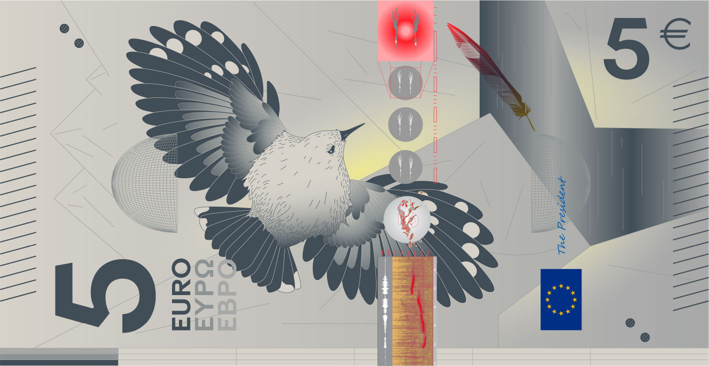
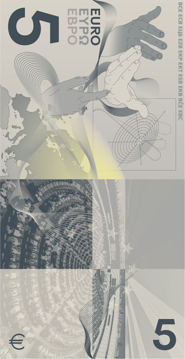
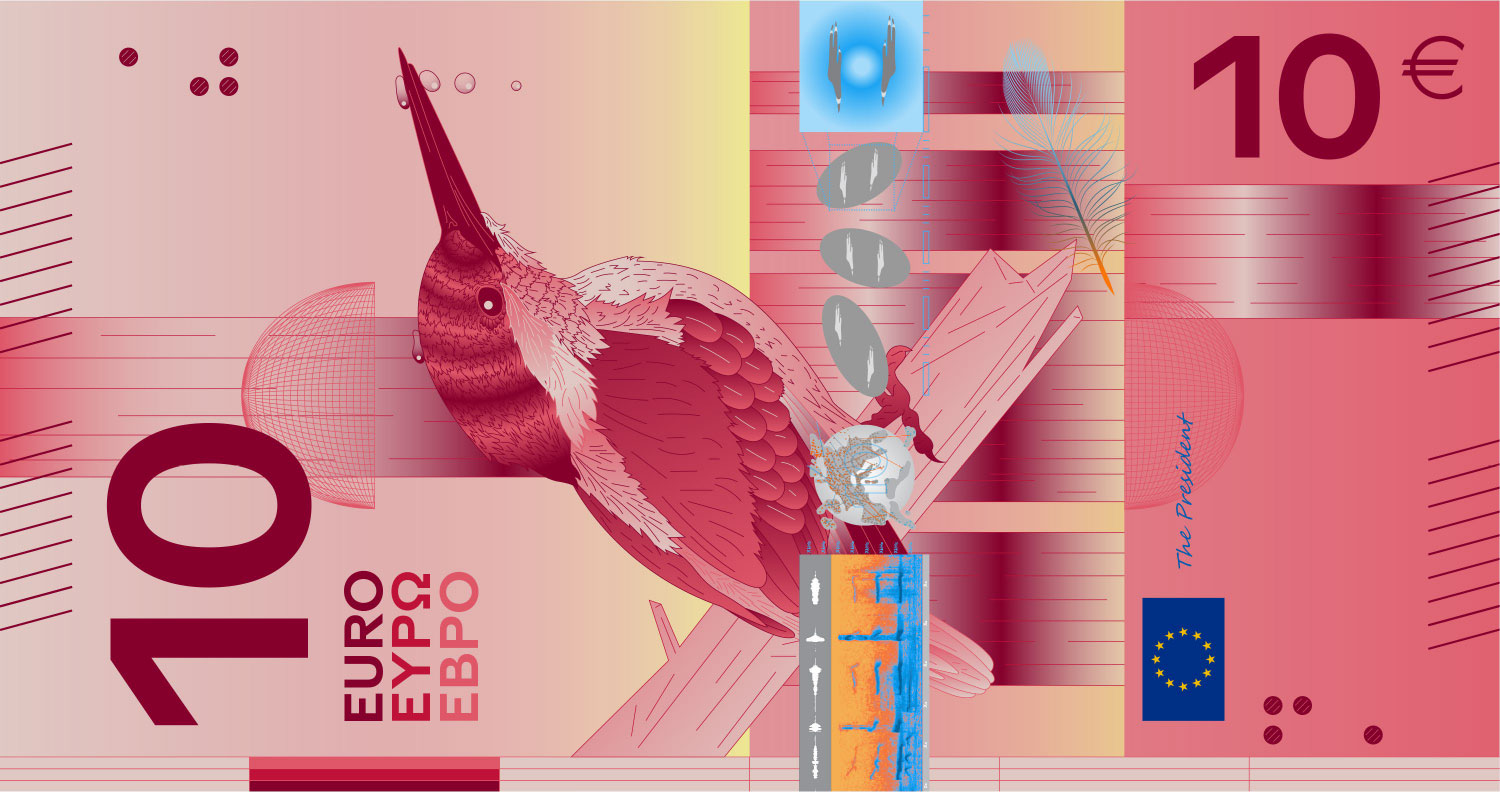
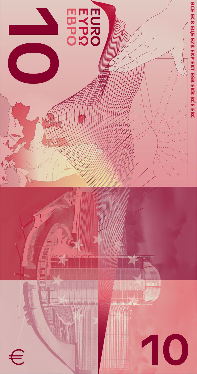
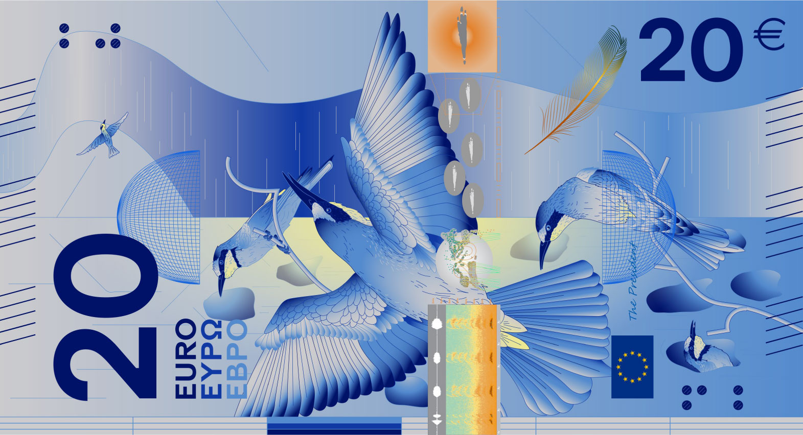
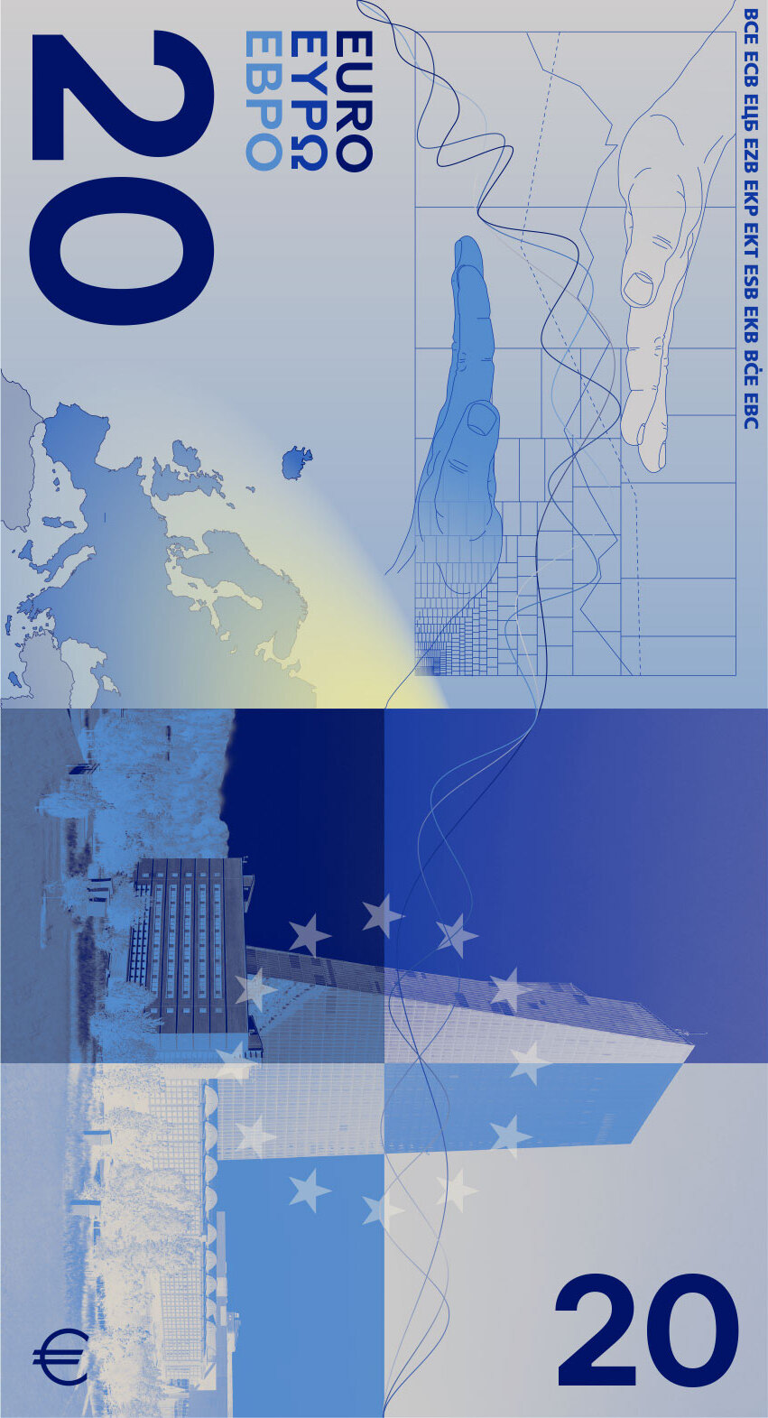
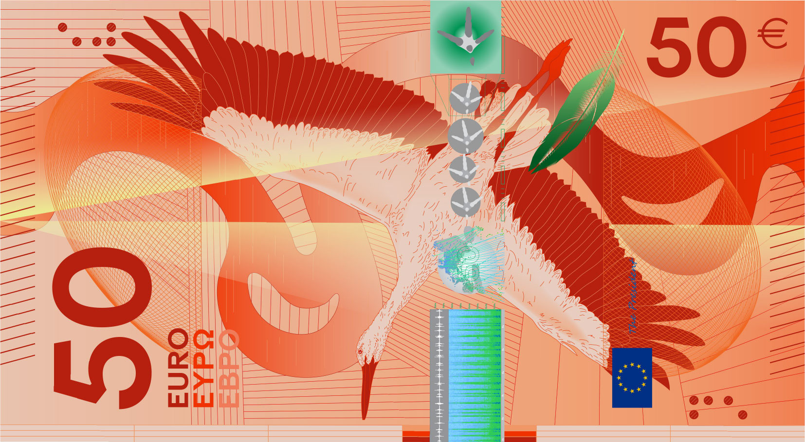
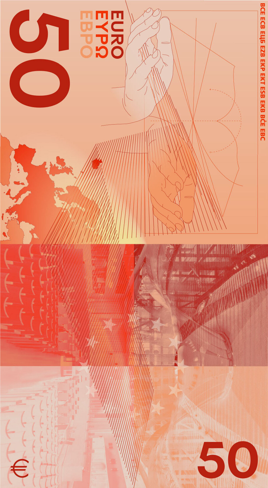
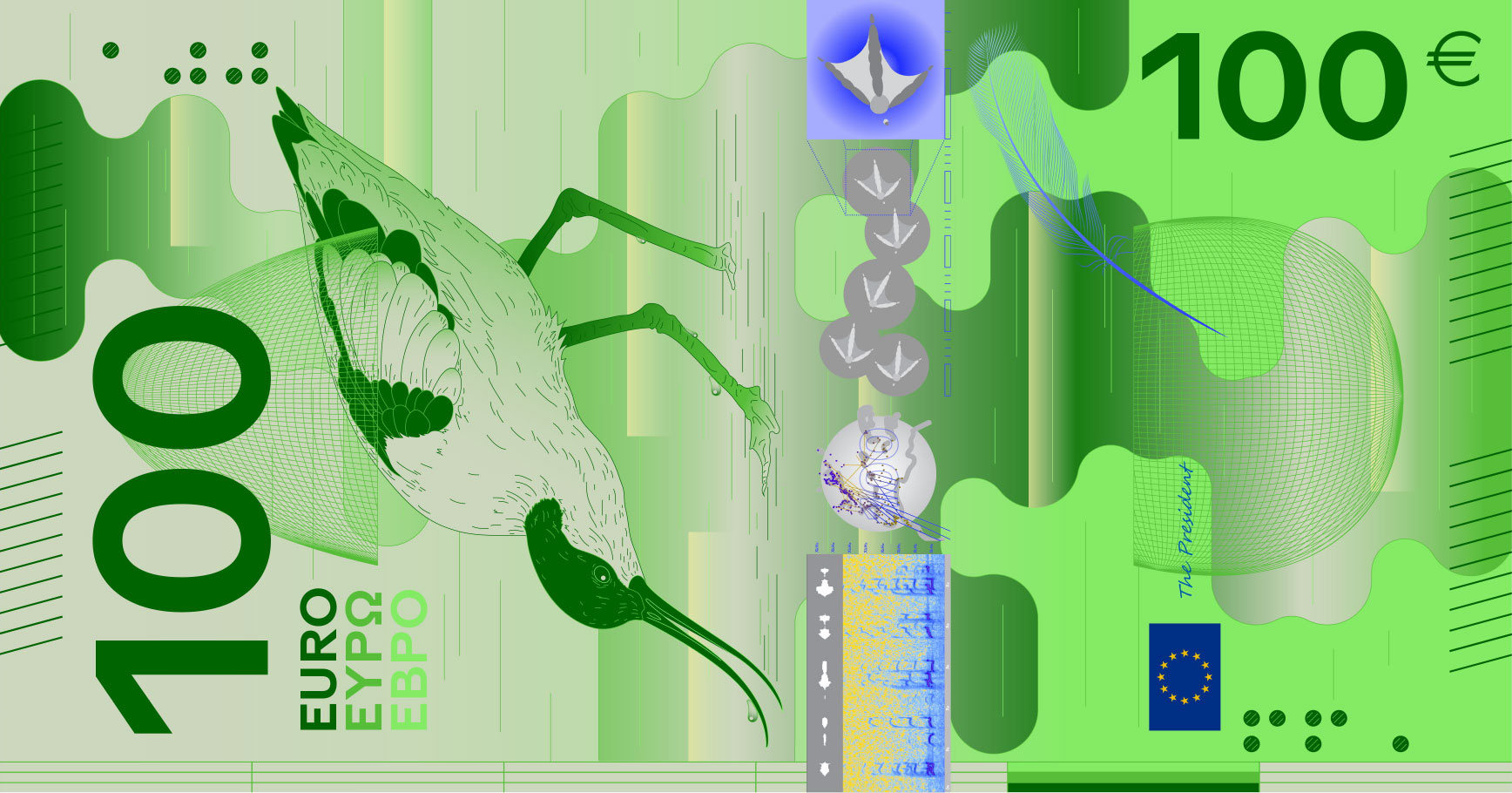
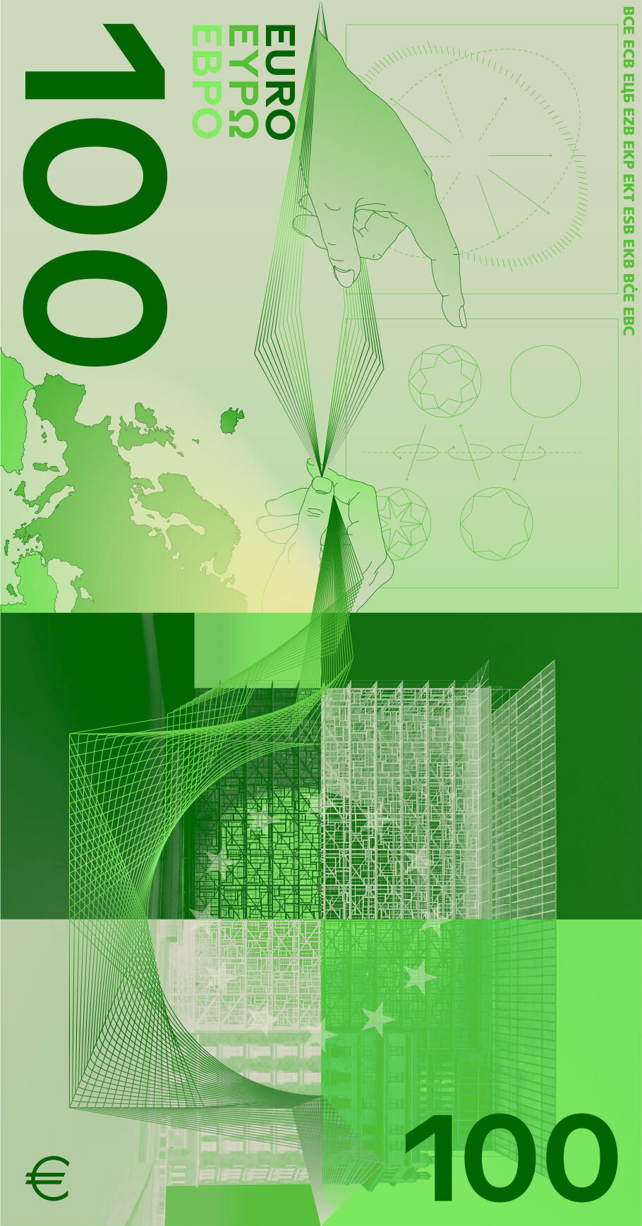
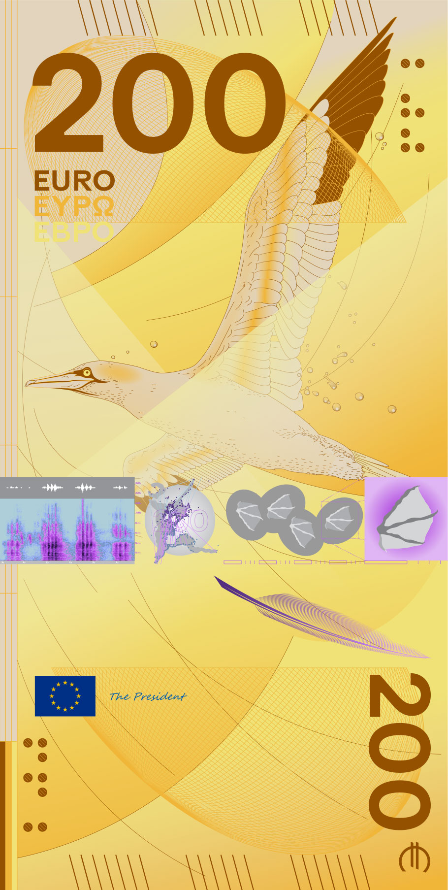
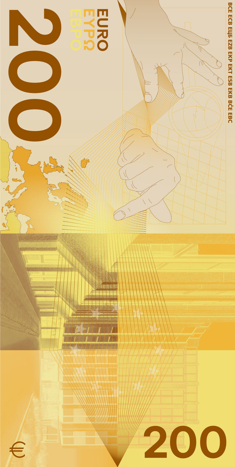
From a purely practical standpoint, I adore this design. The banknotes are plain rectangles, as in every other design, but what sets Messrs Guedj and Girard-Meunier design apart is how pragmatic and immediately useful it is. It looks to me that colour is used to set the different note values apart, and is given the focus. The birds are there, of course, but they blend into the background.
This is not to say that the design looks bad. For example, look at the little details added to every note: the feathers, the spectograph of the bird's call, etc arranged in a neat line in the middle of each banknote. I also like the veritcal orientation of the banknotes' fronts.
But what immediately struck me about the design is how pragmatic it is. The designers really took to heart the Improve inclusion and accessibility point.
Design B
By PunktFormStrich.
It is similar to design D in how pragmatic it is regarding its use of colour. However, I am not a fan of the Pokemon card-esque inclusion of the "stat block" on the banknotes, and I really do not like how the buildings on the reverse of the banknotes look in design B.
Design H
By Atelier Goppel-Toperngpong.
Colours are there, but they are washed out, which makes it more difficult to distinguish the €5 note from the €20 one, for example. I think this is the weakest design from the Rivers and birds theme.
Design J
Mr Tietäväinen's is brilliant. Not only is it practical in everyday life (with distinct colors, and clearly visible denomination), but they are also little works of art.
The drawings of birds look great. The river on the bottom of the averse of each banknote is the same, but the position of the bird's silhouette moves closer to the sea as the value of the banknote increases.
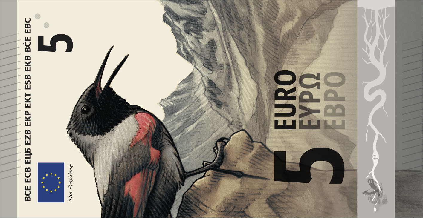
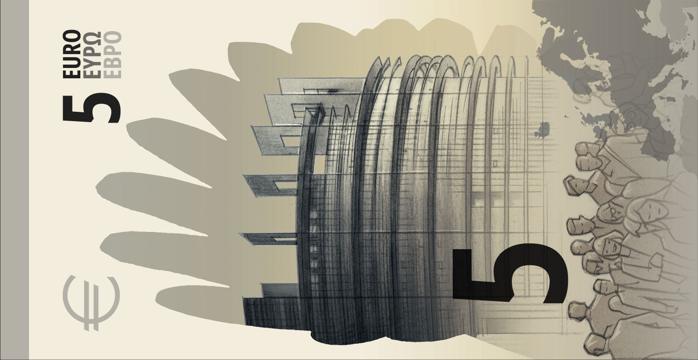
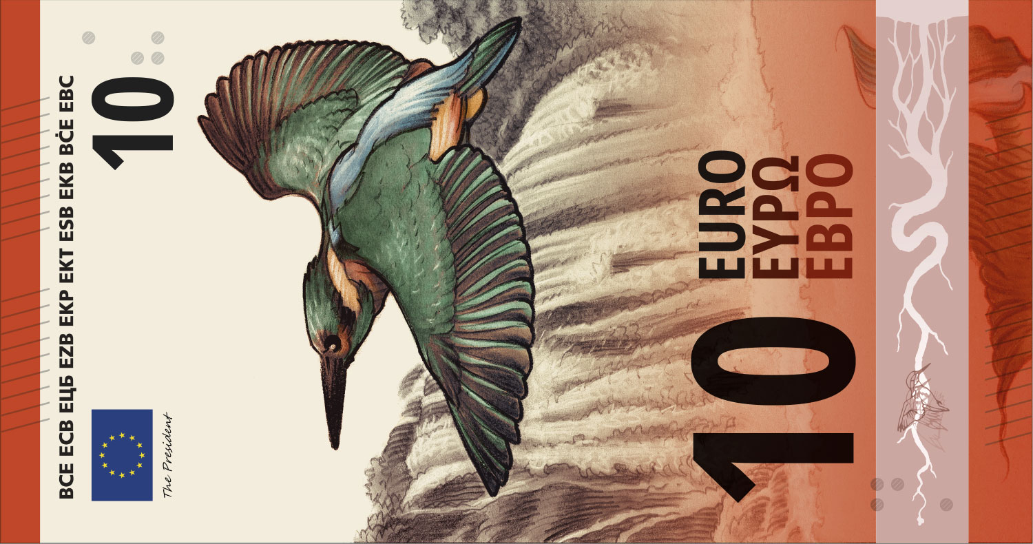
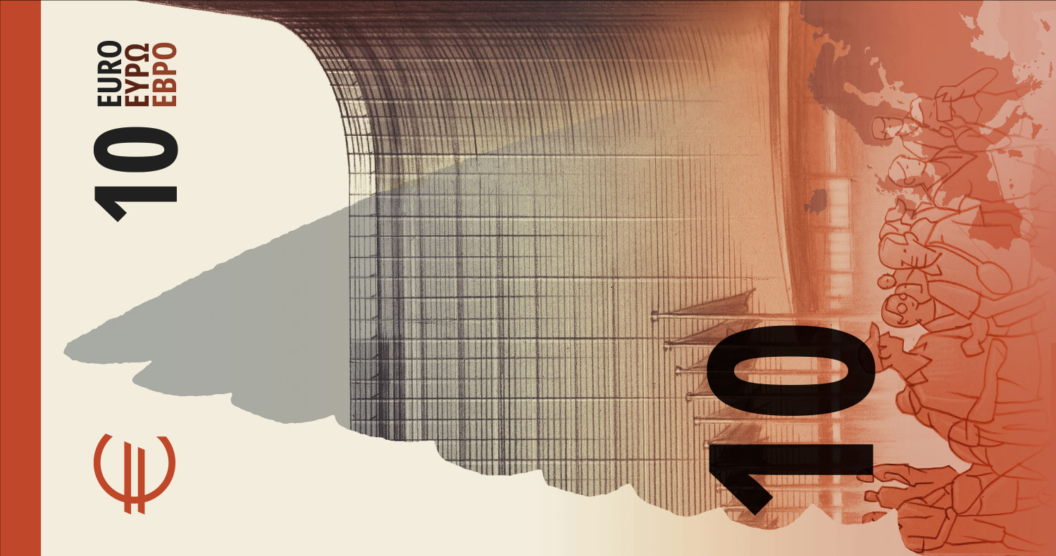
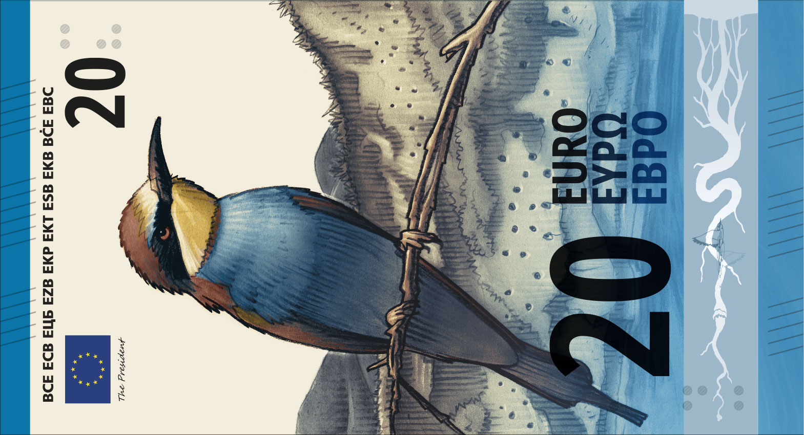
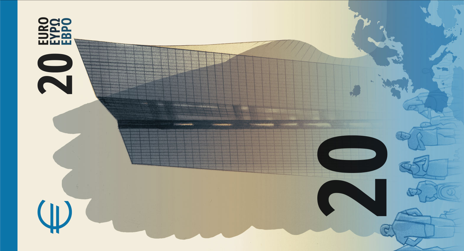
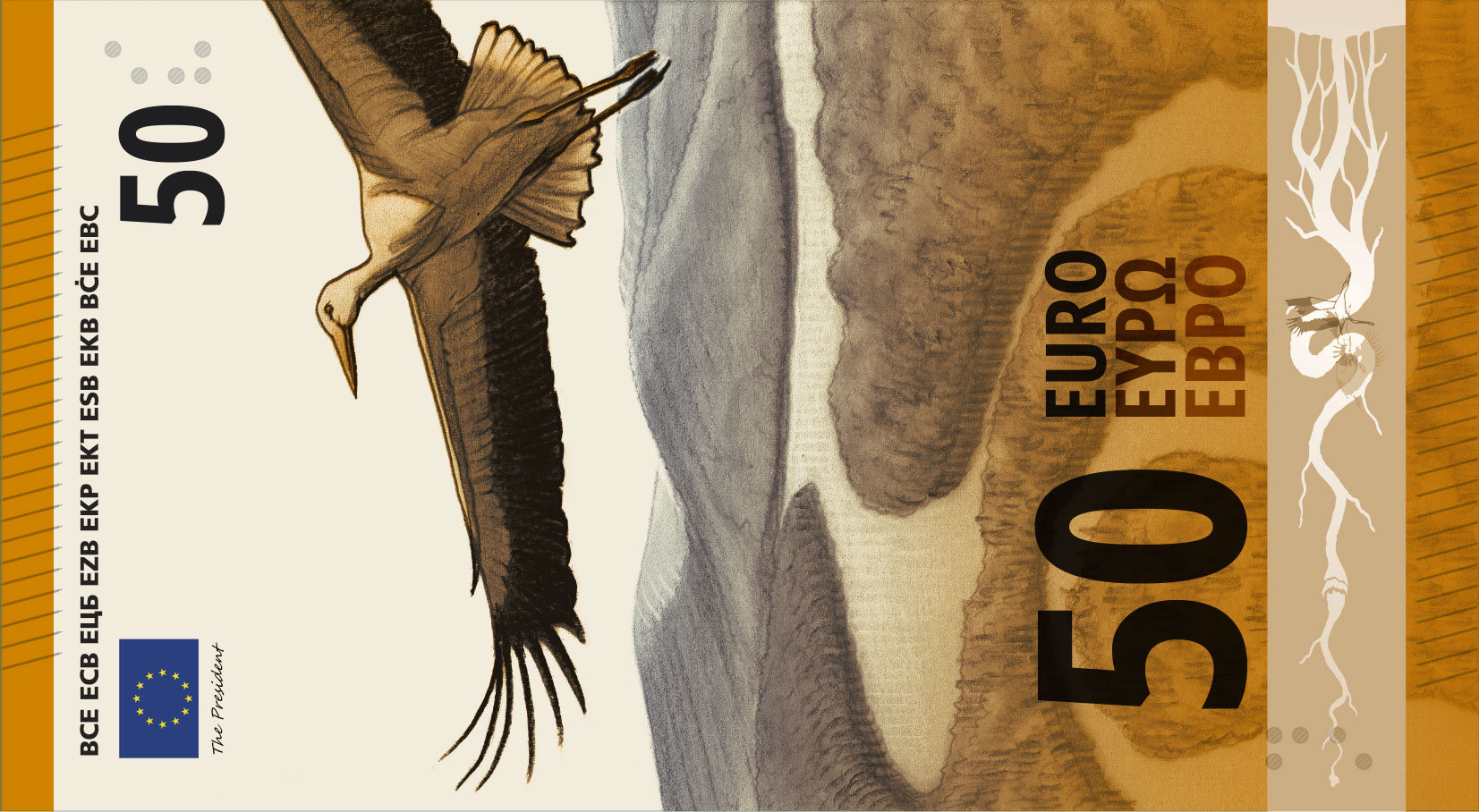
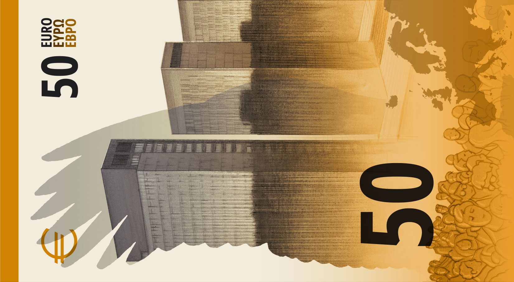
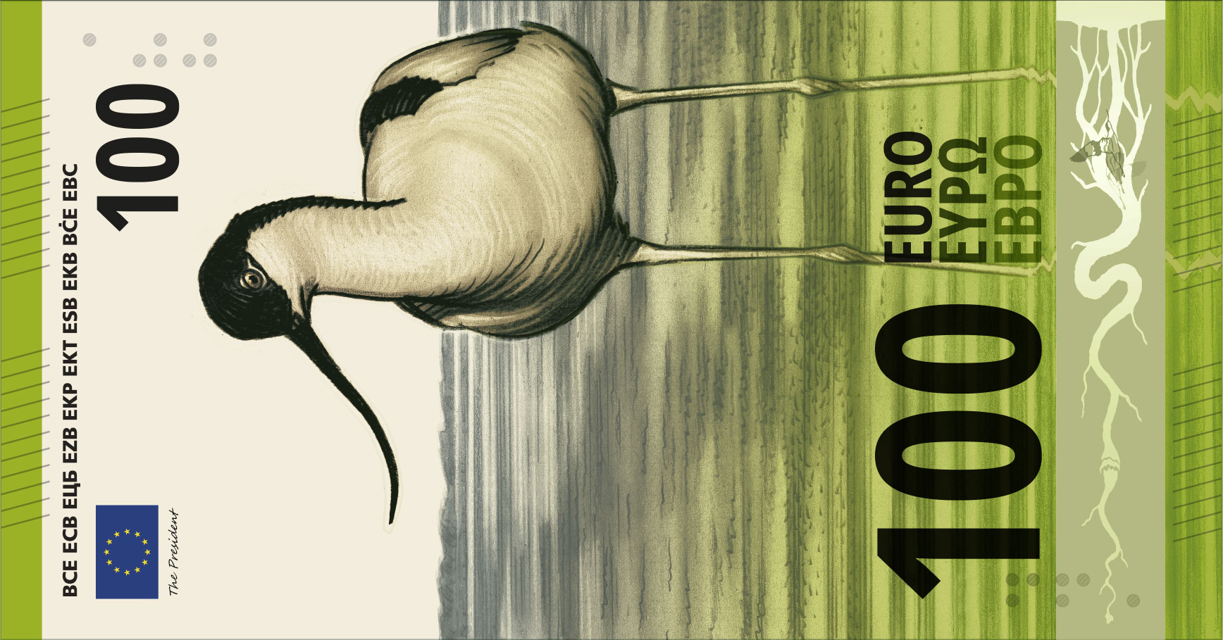
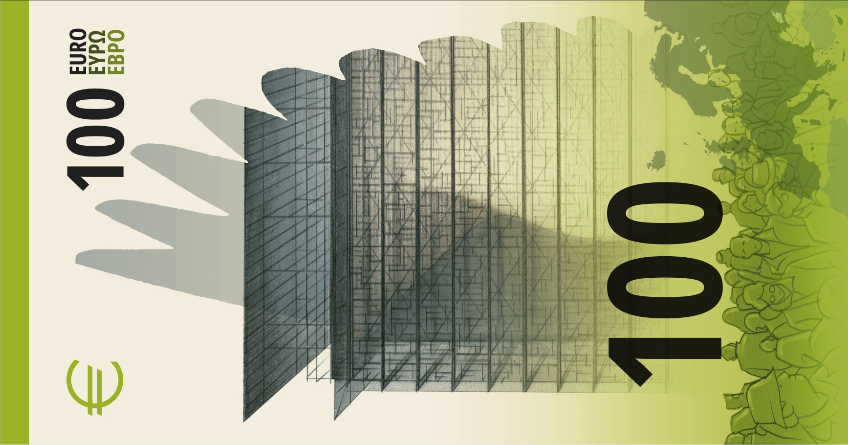
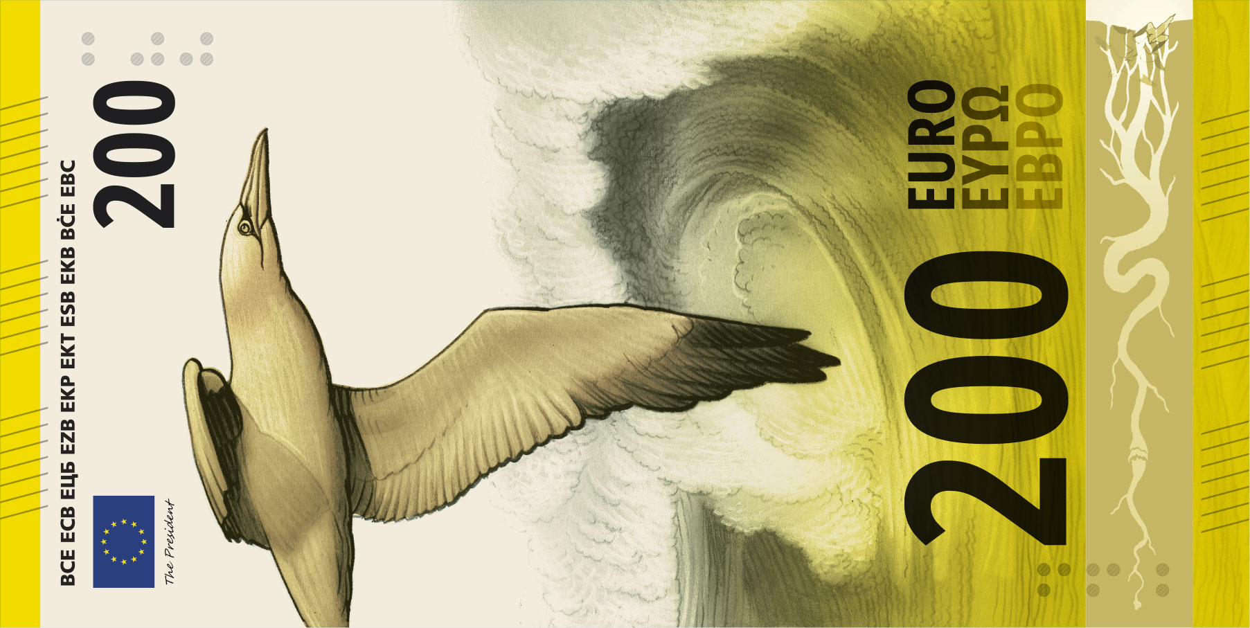
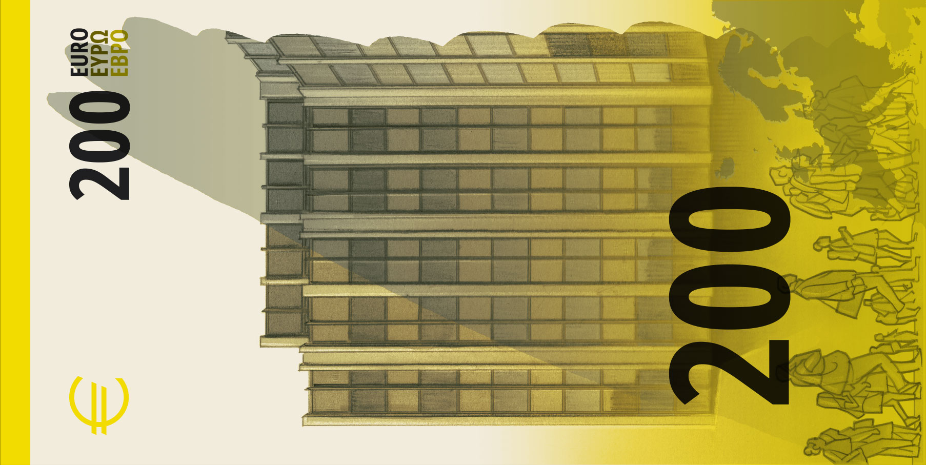
The only thing I do not like are the side-of-notebook style drawings of people on the reverse. They just do not fit with the rest of the banknote, in my opinion.
Design I
By Isabelle Daëron.
Other designs were good, pragmatic, or brilliant.
Mrs Daëron's one is simply incredible.
It combines pragmatism and usefulness with elegance and taste. I think it is the strongest design overall.
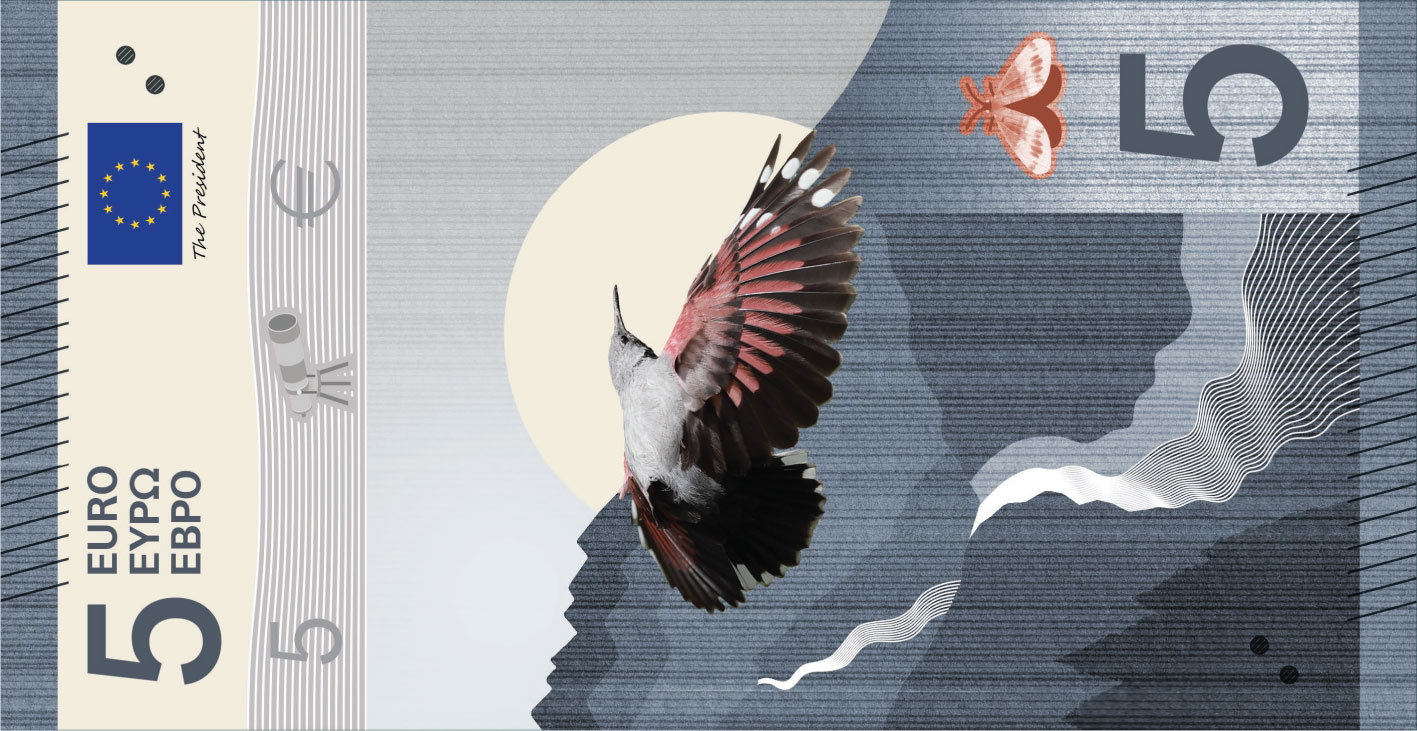
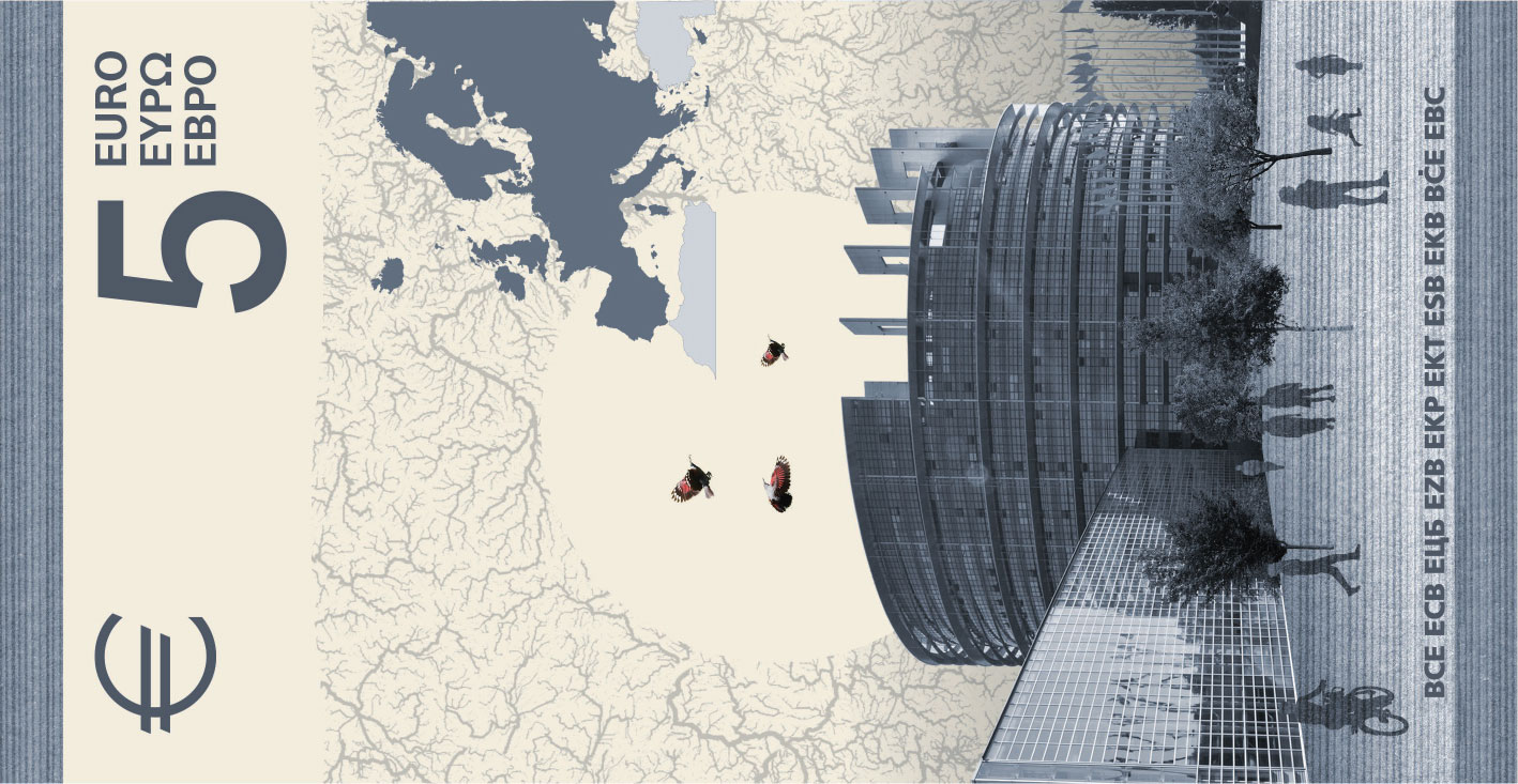
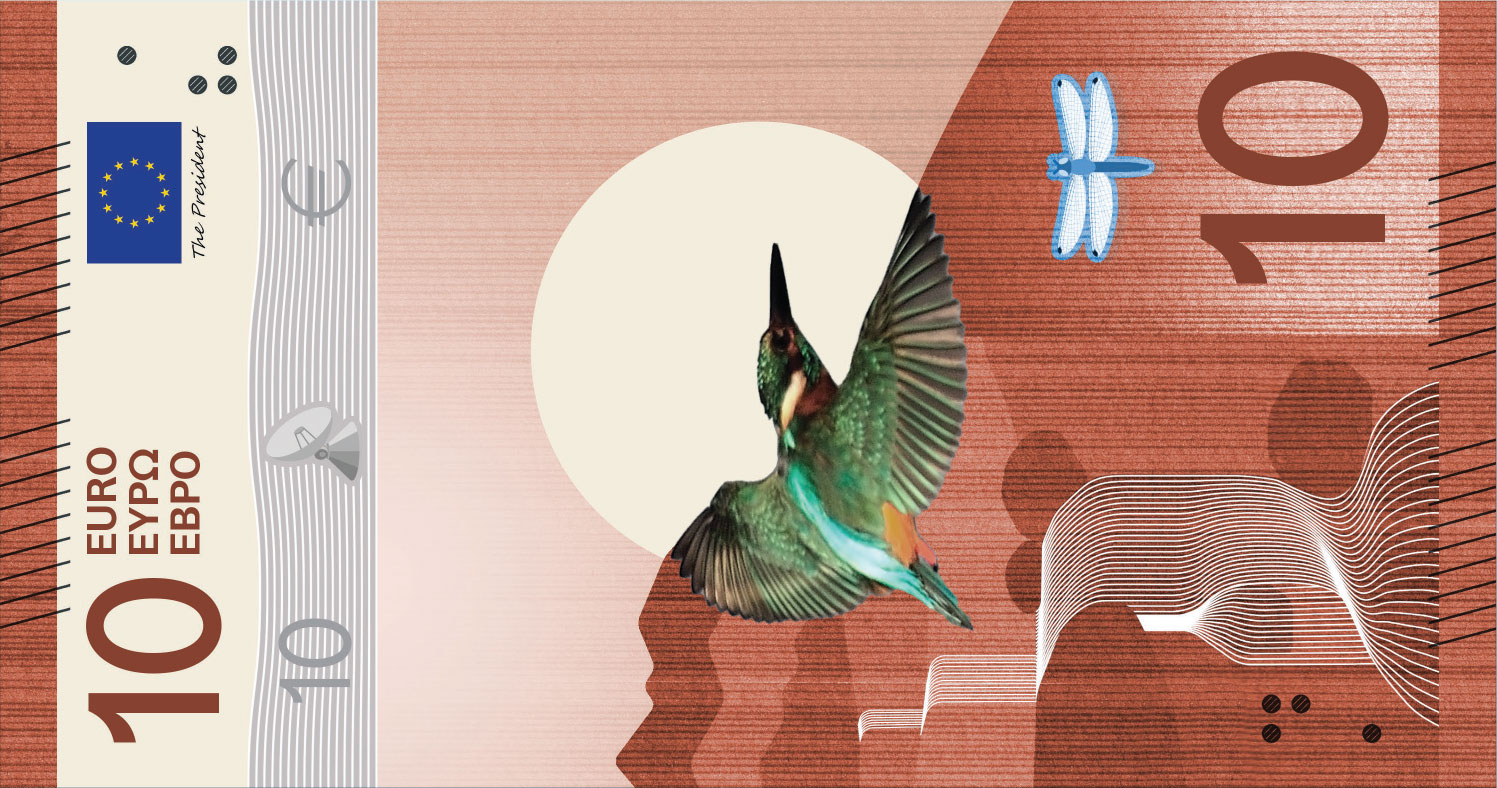
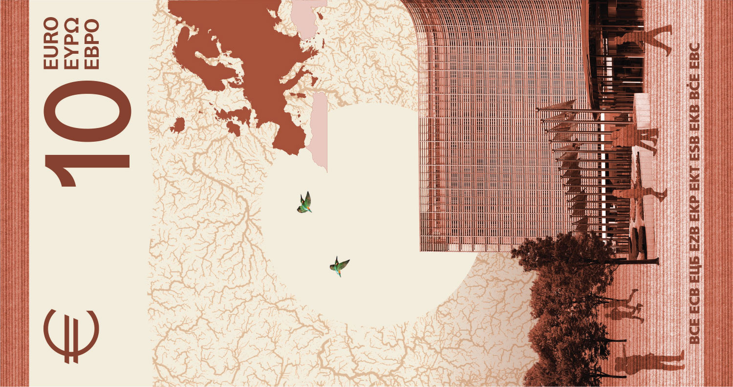
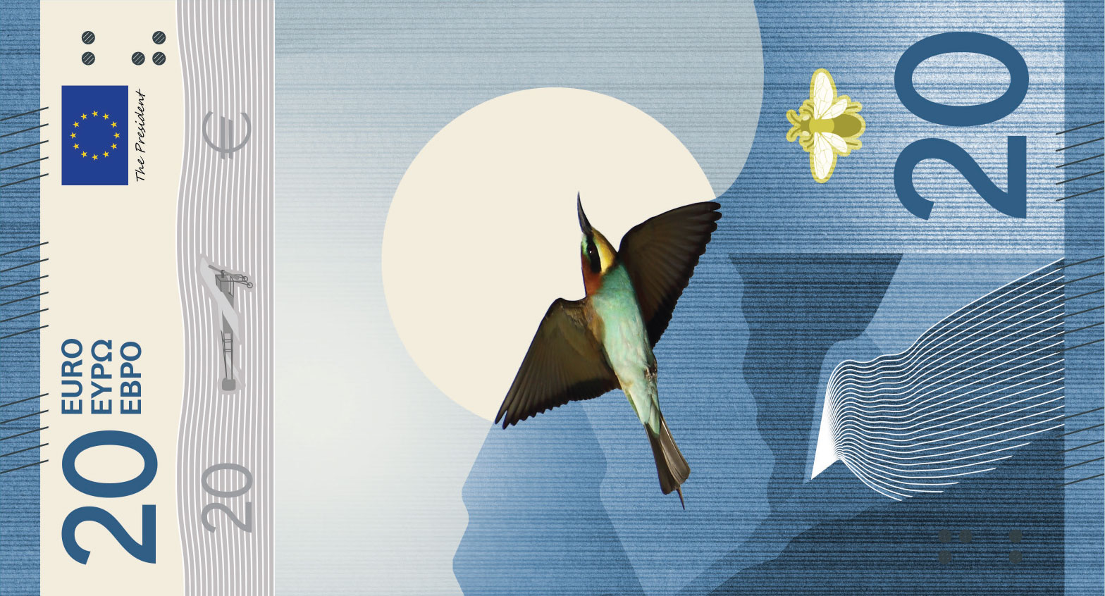
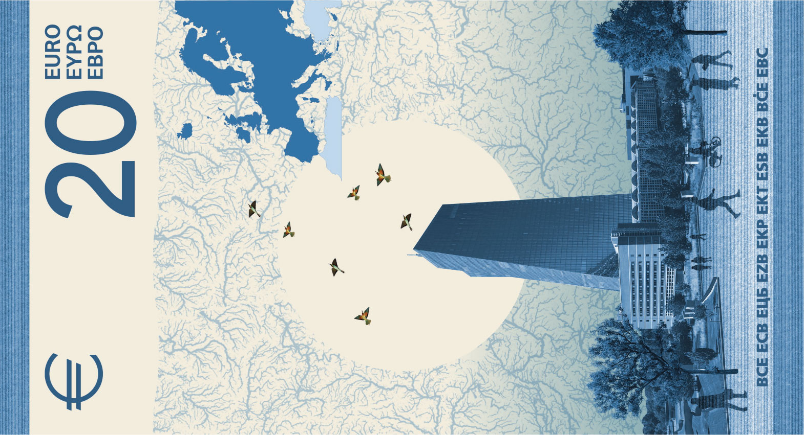
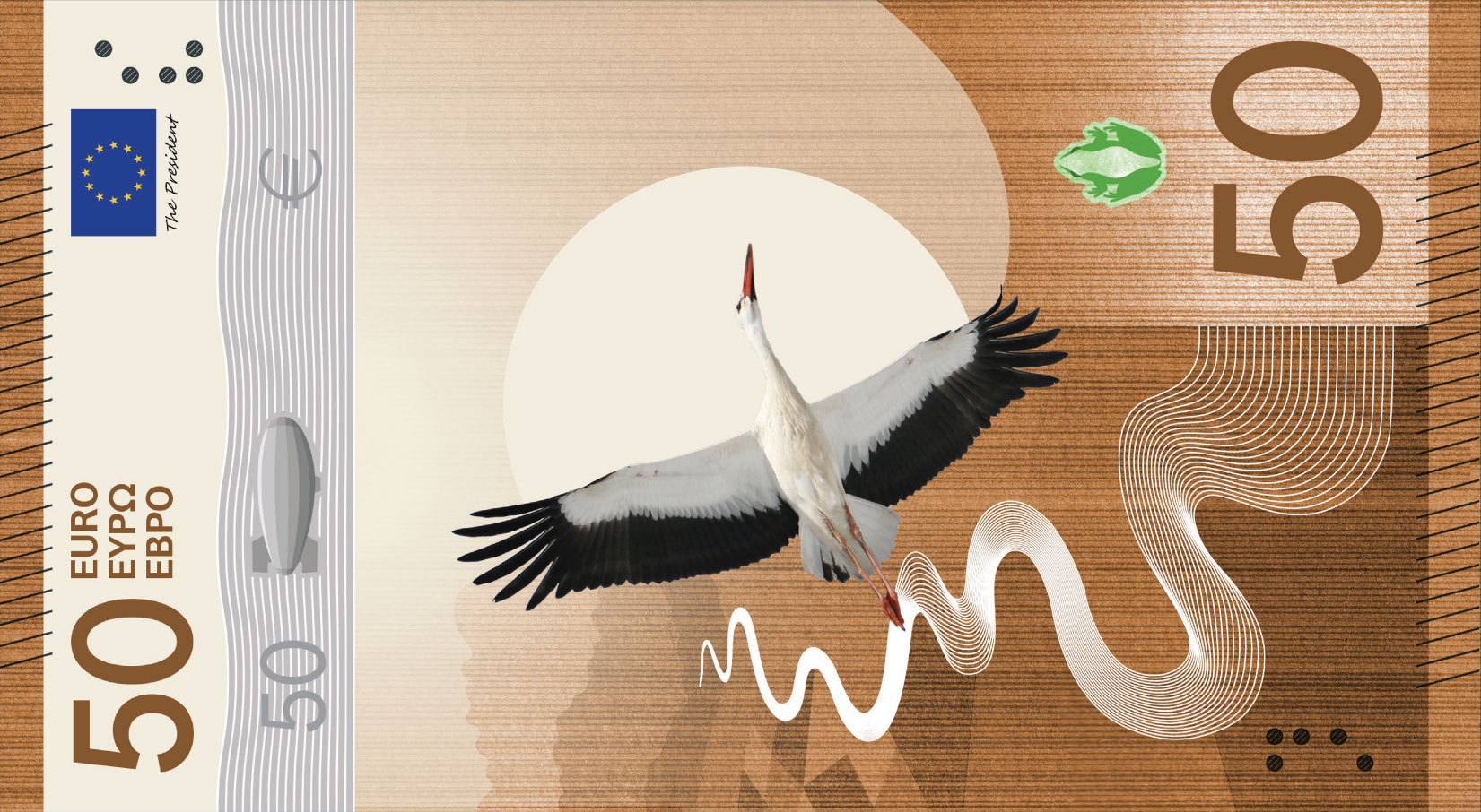
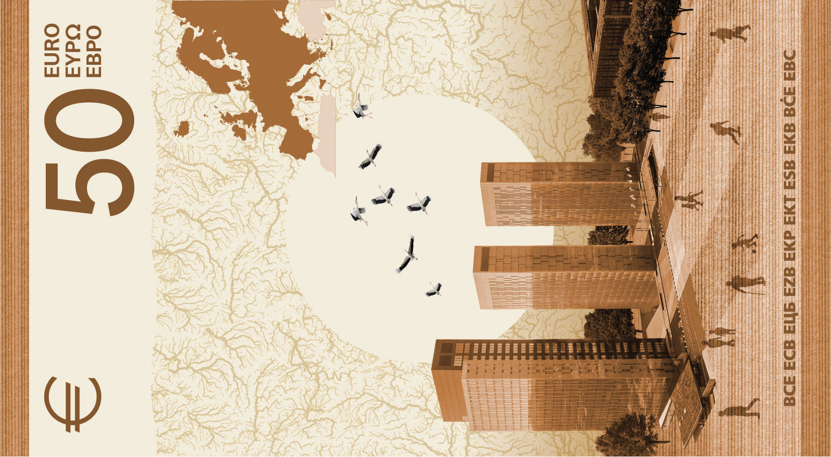
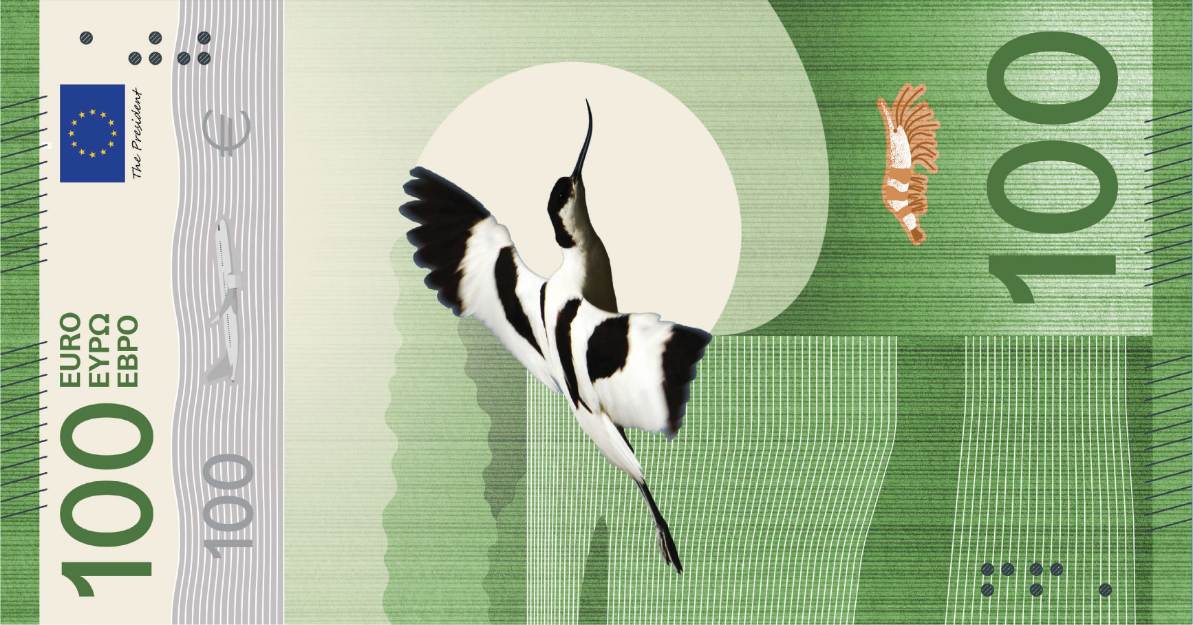
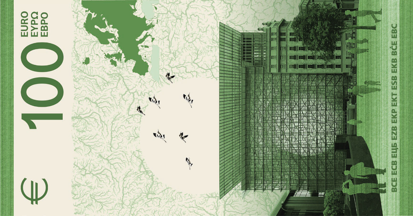
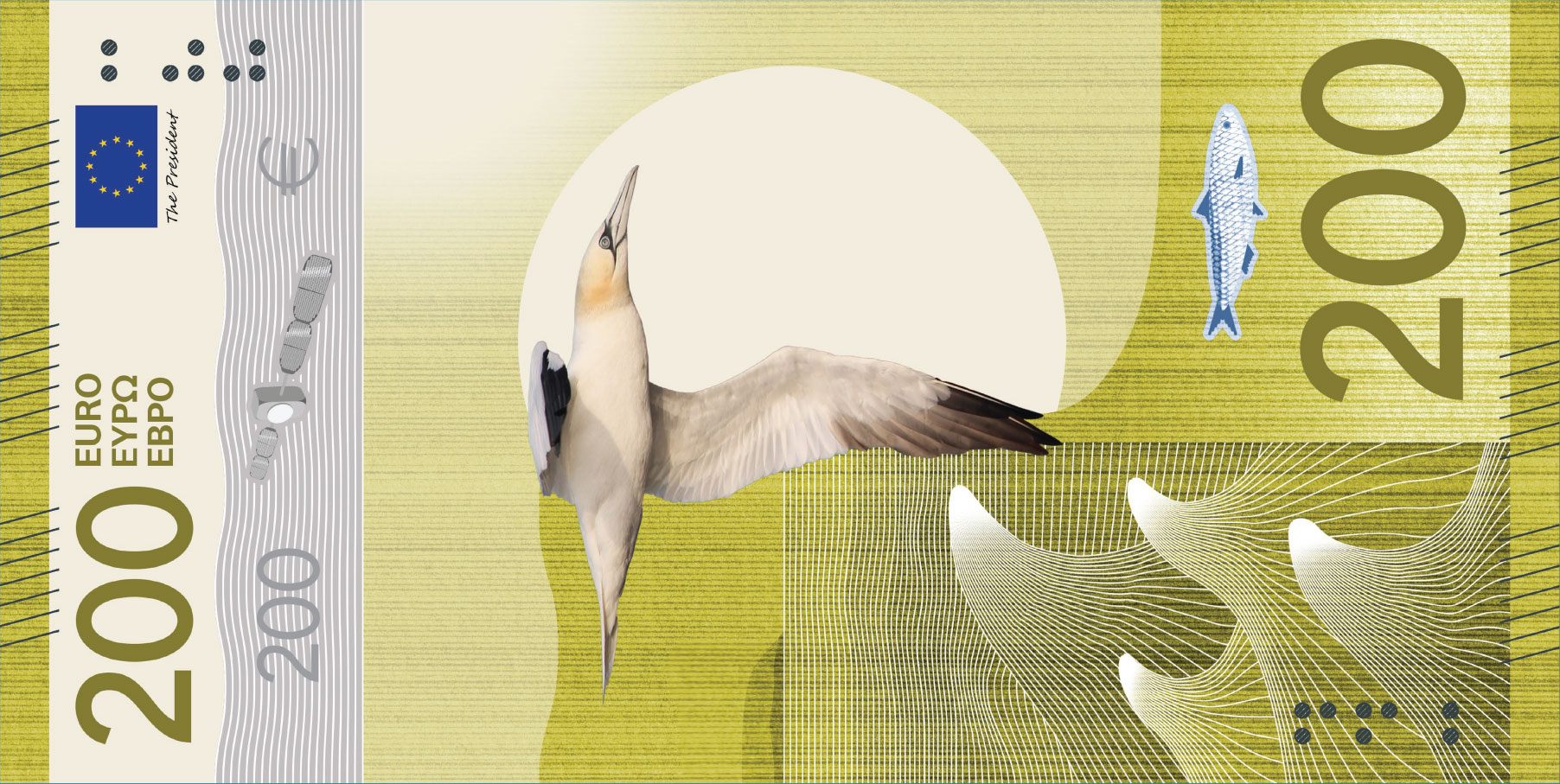
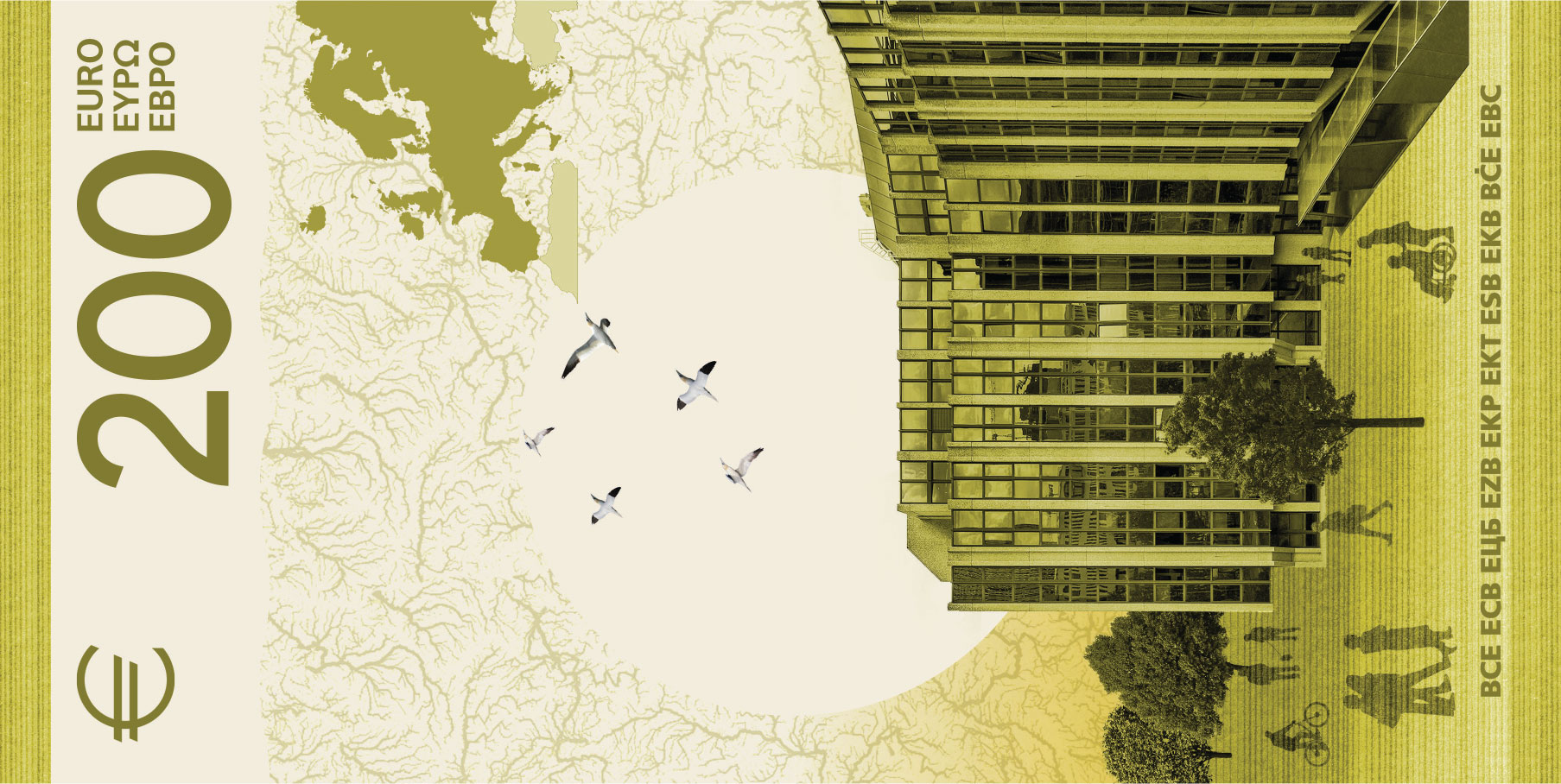
I think what I like most about this design is that it puts function first and makes form follow. A banknote's raison d'etre is its utility as a representation of monetary value, so, naturally, form will be a second-class consideration, but it is not wholly irrelevant. We live in a civilised society and can afford to be surrounded by things that are not only functional, but also aesthetically pleasing.
Take even a quick glance at the banknotes, and you will immediately see the consistency and style. There are always the same elements, in the same position. On the averse, there are:
- the "sun" (the white circle) in the central position
- the bird on the left side of the circle
- the river (or some body of water) in the lower-left corner of the banknote
- the bird's prey in the lower-right corner of the banknote, above the denomination
- something that lets us, the civilisation as a whole, reach the sky on the wavy strip above the artwork
Notice how the "something that lets us reach the sky" is a progressively more advanced device, matching the increase in the value the banknote represents.
On the reverse there are:
- the "sun" (matching the position on the averse!)
- the map of Europe in the upper-right corner
- the map of rivers as the background
You can overlay all the different denominations over each other and see the pattern emerge:
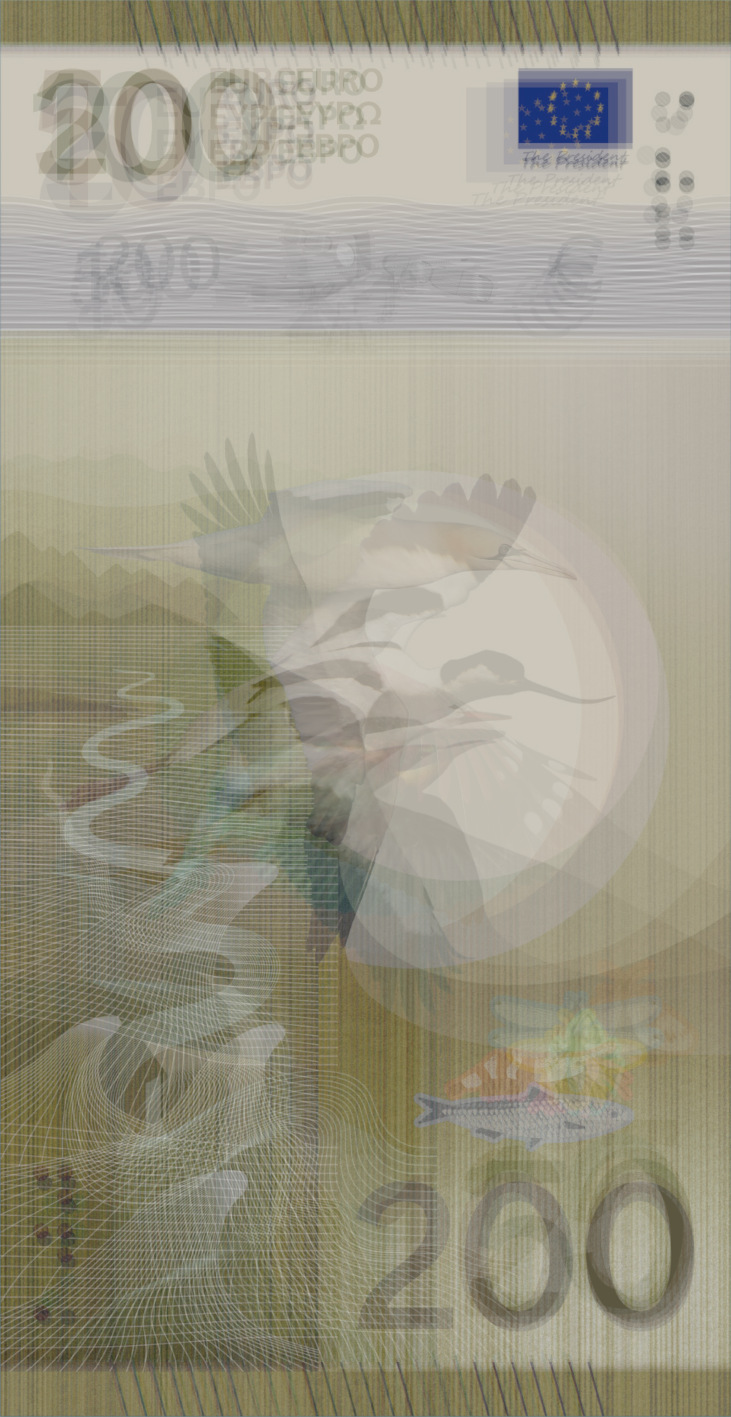
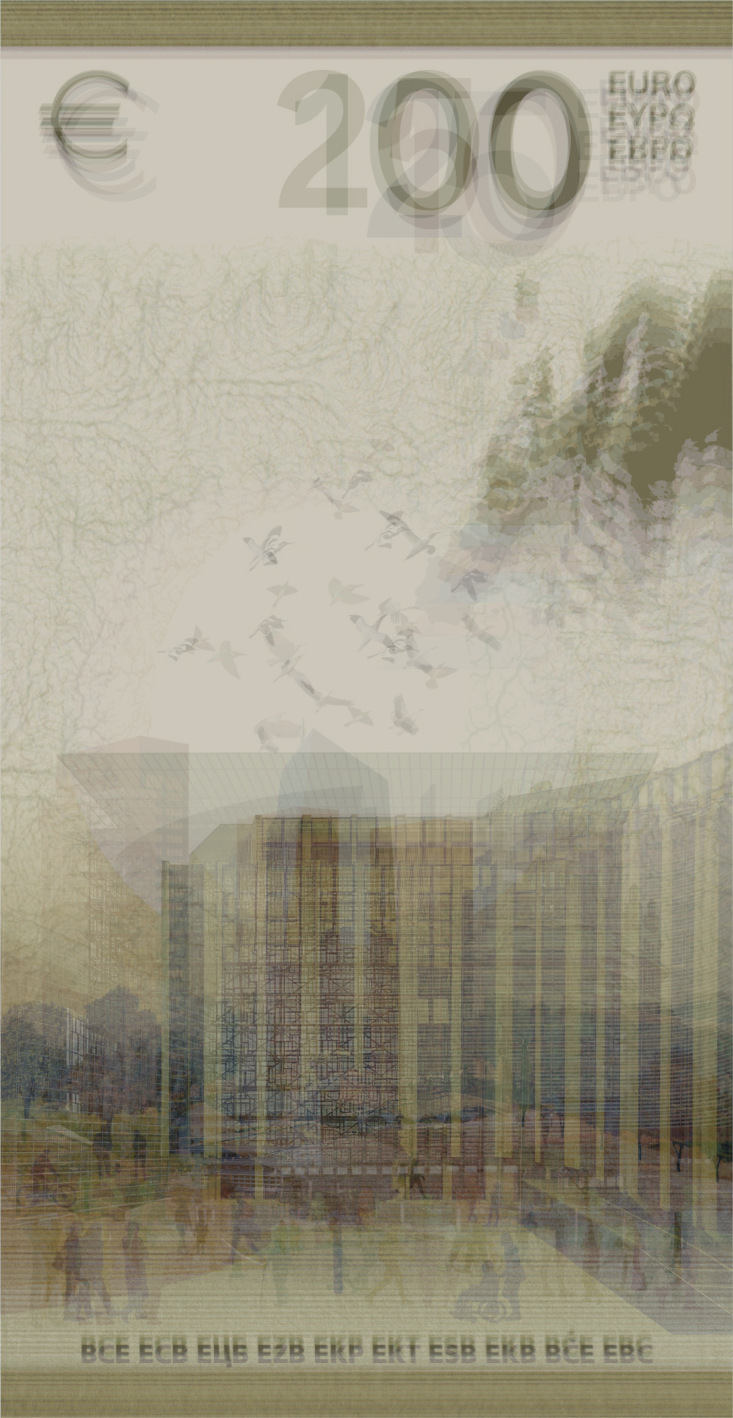
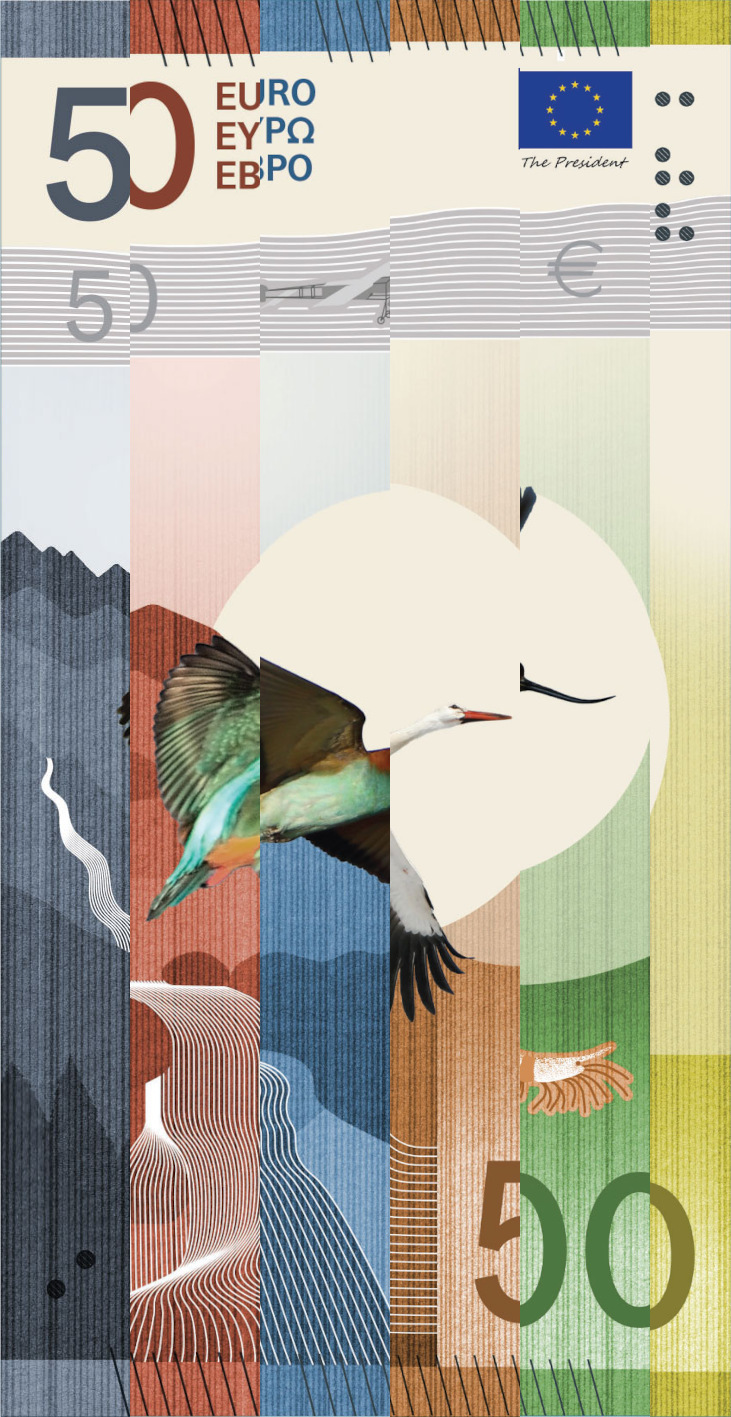
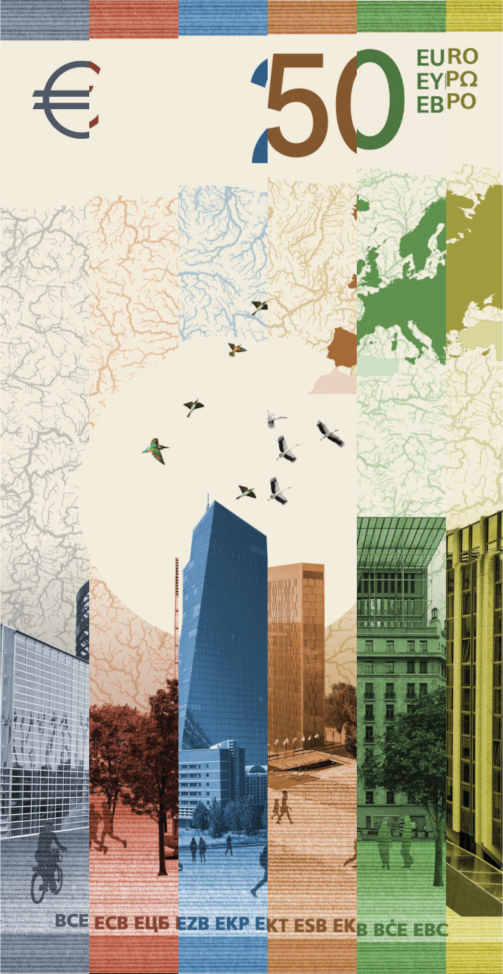
I just love how neatly it is all arranged. It does not line up perfectly, of course, but the banknotes are not all the same size — I had to scale them to make the comparison work, but I still think the intention of Mrs Daëron ie, have a core pattern around which to arrange details for each banknote, is obvious.